Is Showit Bad for SEO? Unbiased Review for 2025
As a full-time SEO consultant and speaker, I don’t think there is a question that I get more than “What website platform is best for SEO?” And then, the number 2 question is inevitably “Sooo, is Showit bad for SEO? Or is it ok?”
For several years now, I’ve had a note on my phone that I add to with my frustrations about Showit SEO and the usability of the platform. It’s time a do a really in-depth blog post with my thoughts.
But let me fast forward to the answer you want before we get any further into this Showit review. 👇
The quick answer— Is Showit Bad for SEO?
So is Showit good or bad for SEO? The answer: Showit is fine for SEO— if you can figure out how to set it up right (and clean up the messes it makes).
But realistically, I think that’s the wrong question. Asking “Is Showit bad for SEO?” puts way too much emphasis on the website platform, and at least 80% of SEO is not platform-specific.
The right question is:
“Can a website rank well if it’s on Showit?” And the answer to that is yes, without a doubt.
If you know what you’re doing and avoid its pitfalls, Showit can absolutely rank on Google.
Need proof? Here are the rankings for a few of our photographer and wedding industry SEO clients who are on Showit:
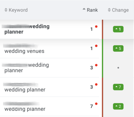
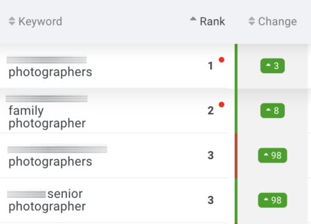
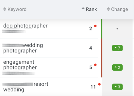
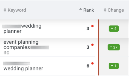
These websites all rank on Page 1 of Google (top 10 position in the “Rank” column).
So Showit is fine for SEO and can rank. But in so many ways, Showit does not make SEO easier for its users, especially when I compare it with the features of the other website platforms we work on.
That’s what we’re going to dig into today.
How is this Showit SEO review unbiased?
I have specialized in wedding SEO services since 2017. In that time, my team and I have optimized over 350 websites for SEO, on website platforms including Showit, WordPress, Wix, Squarespace, Weebly, Webflow, and Pixieset. I have also coached over 1,000 students on setting up their own SEO through my wedding SEO course.
Unlike most of the articles about Showit SEO answering “Is Showit bad for SEO?,” I’m not trying to talk you into using Showit.
If you choose Squarespace or WordPress or Wix instead of Showit, we can still work with you. I don’t have any reason to convince you to use Showit.
So. Here’s my honest Showit review.
In this Post
A few caveats off the top:
- Some of this is going to get technical. If you are a Showit user, you don’t need to understand what I’m about to say to get your website to rank. You could start with 1 Hour SEO to learn how to do your basic SEO in an approachable way.
- Not all of these problems or issues are of the same level of importance, so I’m going to try to indicate importance with levels Red (high), Orange, Yellow (low)
- I’m sure I’m going to miss something, no matter how many words I type. Feel free to add your thoughts in the comments section.
What I like about Showit for SEO
Showit includes all the necessary SEO features
Showit has done a good job making sure we have the basic features we need to set up your website’s SEO:
- Page SEO titles
- Meta descriptions
- Image alt text
- Heading styles and text properties
- The ability to add a blog (which I highly recommend for SEO)
Flexibility with text property tags
This is one of my team’s favorite things about Showit: Any text can be labelled as H1, H2, H3, paragraph, navigation, or div.

Said another way, the HTML tag applied to the text doesn’t affect its formatting. On other platforms (like Squarespace and the default WordPress block editor), making a line of text “Heading 2” makes it bigger, which gives you less freedom with design if you want proper heading structure.
On Showit, if you understand SEO, you have a lot of freedom to create a clean page structure with your heading tags (it makes me so happy!).
But… this is only a good thing if you know what you’re doing. More on the problems Showit’s default headings create if you don’t know what you’re doing below.
Even background images can be optimized for SEO
On other platforms, images that are used as canvas backgrounds are generally coded as background images in CSS (different from being main page content).
On Showit, you can apply alt text to background images, and they’re coded in a way that Google can find and index them. This can boost your SEO and help those background images also be included in Google Image searches.
So those were my main positives for Showit SEO. Let’s dig into what I think could be improved in the “Problems” section below.
Showit SEO Problems
Let’s start with a simple one:
No visualization of SEO title & description
SEO Threat level: Yellow
- No SERP visualization
- No guidance for proper meta description length
Showit has made some improvements to the SEO settings panel in the last few years, like making the SEO title space larger.
However, Showit users are really at a disadvantage with their SEO by not having SERP (Search Engine Results Page) visualization for the SEO title and description.
Meaning: you can’t see what that SEO title and description are actually going to look like in the search results.
In contrast, Squarespace’s SEO settings and the Yoast SEO plugin for WordPress both offer a “preview” so you can see if what you’ve typed seems too short or too long.
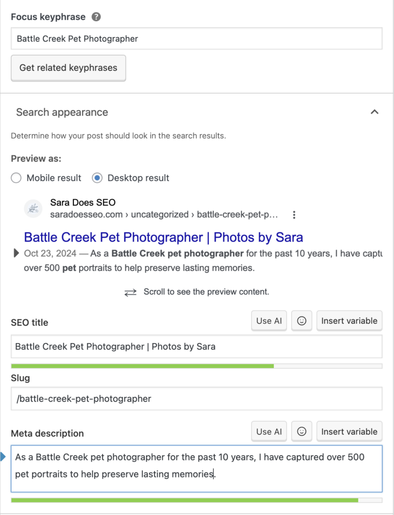
I often see Showit SEO students write meta descriptions that are WAY too short or just random lists of keywords because they don’t understand how the description is used or know what it will look like.
Students on other platforms tend to do much better, because they can see the outcome of their SEO work.
Quick tip: I coach my SEO students on Showit to use Mangools free SERP Simulator to visualize their SEO titles and descriptions and make sure they’re about the right length.
Layer order is opposite of HTML output order
SEO Threat level: Yellow
- The order of the elements within a canvas is not the order of how elements are output in the code
Ok, take a look at the list on the left and tell me which element you’d assume comes first in the page code (1 or 2?):
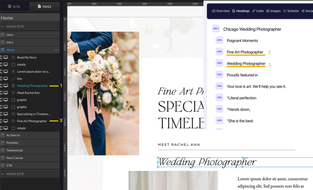
If you said #1, I’d say that would make sense. But, it’s actually… the complete opposite. Showit outputs all of your page elements in the opposite order of how you stack them in the panel on the back end (bottom to top).
If you want your content to be read in order by Google or screen readers, you have to organize it bottom to top.
This is completely unintuitive, and I can tell you that very few people order their layers right (including template sellers and pro Showit designers 😱).
I agree with Showit’s SEO guide that sites can still rank well with disorganized layer order, but WHY is this a thing?
I’m not an accessibility expert, but this seems like a pretty serious problem for visitors using screen readers, even if it doesn’t seem to prevent a site from ranking on Google.
Issues with duplicated pages
SEO Threat level: Red
- Duplicating pages duplicates the page’s SEO settings
- And the “Ask Google to ignore this page” setting
Because Showit pages are complicated to build from scratch, most users start a new page by duplicating a page that already exists on the site.
What most users don’t realize is that this also duplicates all of the page’s SEO settings and Advanced settings.
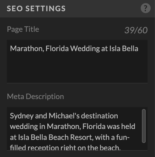
I have seen this create issues in two ways:
- Duplicate SEO titles and descriptions: Two pages now have the same SEO title and description, which is bad for SEO.
- Pages unintentionally set to no-index: If the original page was marked “Ask Google to ignore this page” in Advanced settings, the new page is too. That means Google will not index it, and it can’t be found in search results.
If you’re a Showit user, make sure to check the SEO and Advanced settings of a duplicated page. Clear out those boxes, or customize the information for the new page.
Showit might consider not duplicating the SEO settings when a page is duplicated. I can’t imagine why you’d want this information copied, and I think this hurts more often than it helps.
Over-use of Heading tags
SEO Threat level: Orange
- All styled text comes in with an H1, H2, or H3 tag
- Heading tag usage is generally excessive and disorganized
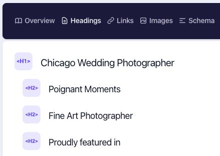
For the best SEO, we use headings to convey the sections and hierarchy of our page content. I recommend having 1 H1 tag per page and then marking section headings below as H2 (and sub-sections as H3 when those exist).
Ideally, your headings would be structured something like this (1 H1 and sections marked as H2):
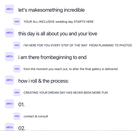
Instead, the heading situation on Showit sites we’re given for optimization usually looks something like this:
🫣
Showit sites that we optimize have the absolute messiest disasters of heading tags (H1s, H2s, H3s with no rhyme or reason)— much worse than any other platform.
Is this Showit’s fault entirely? No. Users and designers are the ones using heading tags out of order and not fixing them.
But I would advocate that all text blocks could be brought in as <p> paragraph text by default and then users could apply text properties to set selected text elements to <h1> and <h2>.
Bringing in all larger-styled text with a heading tags pre-applied is not working to create a good page structure on most Showit websites, and it’s a default choice that generally hurts their Showit SEO setup.
Hidden elements are part of the page code
SEO Threat level: Orange
- You may think an element is hidden, but Google can still see it
One feature of Showit that designers love is that you can create completely different experiences on mobile and desktop.
The problem? This often involves creating elements that are hidden on one version of the site or the other.
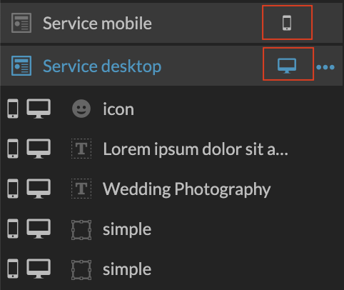
The way that Showit does this in the code is with CSS display:none.
Basically, this means that a “hidden” element is still included in the page code, loaded, and then hidden from the viewer.
Why is this a problem?
- Unnecessary code is loaded, potentially slowing down page load speed if there are a lot of hidden elements
- Hidden elements can contain filler text, broken links, and other issues that may cause Google to see the site as lower quality
I have seen Showit users create full pages of entirely separate elements for mobile vs desktop, with dozens of elements hidden on each view. These pages are huge, confusing, and do not rank well.
Another common mistake is keeping elements on the page but hiding them on both mobile and desktop, so they don’t display anywhere (usually template elements). Keep in mind— these elements are still in the page code. I wish it wasn’t an option to have an element on a page if it’s completely hidden.
Showit Image SEO Issues
Image SEO settings are just plain confusing
SEO threat level: Orange
I got a lot of surprised responses when I posted about this on threads.

Did you know that the “Description” box is actually where the important image alt text comes from (not the SEO Title)?
The “title” attribute for an image doesn’t do much of anything for SEO (To learn more about this, Yoast has a good explanation of image title text in their image SEO article).
A couple weeks later, Showit updated the field labels for image elements to provide a little more clarity:
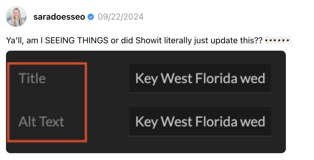
However, this feels like a halfway-done fix, since the Alt Text field is still labelled “Description” in Galleries 🤔
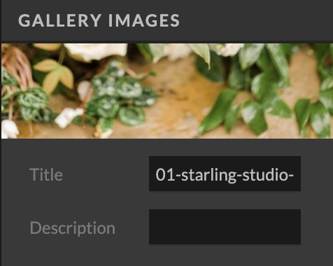
I can see this inconsistency in field labelling being confusing for Showit users.
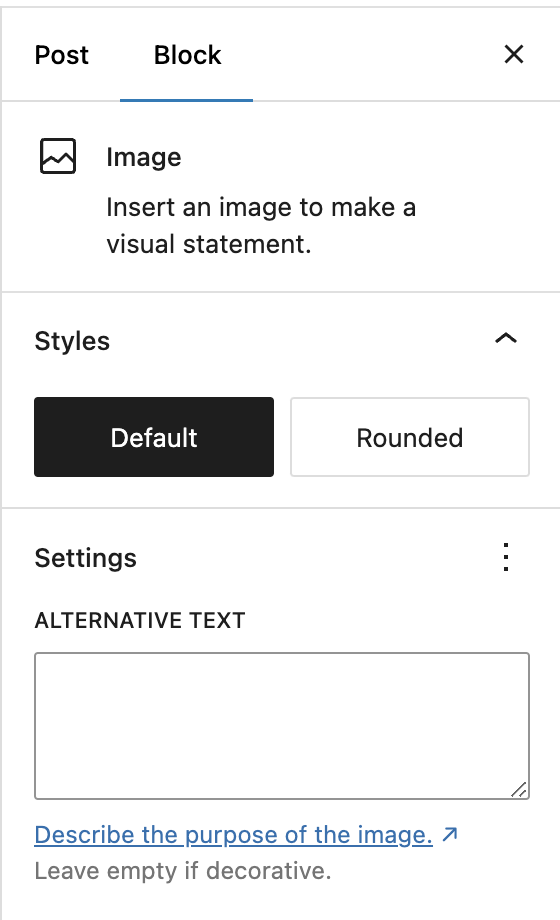
I would love to see the Gallery settings updated and for Showit to consider removing the Title field in this view, the way that WordPress did when the block editor was introduced:
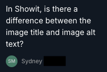
If you don’t think users are confused about the image title box, check out these questions from my recent SEO Lunch & Learn on image SEO:
The title field might still be useful in the Media library to allow users to update image titles for better organization. However, it’s not needed at the page level and is causing more confusion than it adds in value.
URL Issues for Showit SEO
Page names dictate URLs (with no option for customization)
SEO Threat level: Red
- On Showit, the page name is also the URL
- Changing a page name changes the URL and breaks all of the links
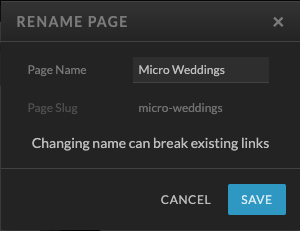
When you use Showit to create pages, the Page Name dictates the “Page Slug”— the URL for the page. This is not how most website platforms work.
It’s not unreasonable to want to use a Page Name that is different than the page’s URL, especially for SEO purposes.
For example, you may want to call a page “Micro Weddings” in your page list but have the URL be /micro-wedding-packages-california. On Showit, this is not an option.
I have seen this cause a variety of problems:
- A client wanted to better organize her Pages list, so she changed a few page names and accidentally broke all the URLs in her main menu
- Pages are hard to find because they’re named for the URL we wanted, not what you’d actually look for in the page list
- SEO students won’t use good SEO-optimized URLs because it makes their pages list feel messy
Every other website platform we work on (WordPress, Squarespace, and Wix) allows users to customize the page slug and make it something different from the page name.

This is one of the top SEO and usability issues I’d like to see Showit fix.
Changing page names breaks URLs throughout the site
SEO Threat level: Orange
- Changing a page name? You’ve broken every link to that page on the website
When you set a click action on Showit, you can set that link to go to a certain page:
I think it’s reasonable to assume that this link will work and update if you change the page’s name to something else.
Buuuut… it doesn’t.
Instead, if you change the linked page’s name and URL, that box just mysteriously goes blank. And the link still points to the old URL.
It would be such a gift to users if the page itself was linked and stayed linked here, even if its name changes.
This would avoid SO many broken links on Showit sites and give users more flexibility to change URLs without messing up links throughout their websites.
A few more random thoughts on Showit SEO:
This feels like it’s getting long, but trust me that the note on my iPhone is way longer. 😉 Let me know if you’d like me to expand on any of these:
- Showit’s sitemaps have no formatting and do not follow Google’s best practices for XML sitemaps (no <lastmod> attribute and no additional information about images or video)— the sitemaps on every other platform we use are better formatted.
- On Showit, you can’t change image filenames after upload. On Squarespace, you can do this easily, and on WordPress you can with a plugin.
- Wix users’ basic DIY SEO setup tends to be better because of Wix’s SEO setup wizard.
- Showit does not offer an option for parent/child pages or hierarchical URLs (think /services/wedding-planning or /portfolio/miami-beach-wedding) unless you use WordPress pages.
- A full WordPress migration into Showit includes pages, which are often unnoticed and create broken/shallow/duplicate content.
- When building a Showit site, the blog is not connected until launch. This means you can’t test, fix broken links, or set up WordPress redirects until the site is live to the public (and Google).
Additional perspectives on Showit SEO
I’ll update this section with articles about Showit that include points outside of my expertise:
- Hannah at The SEO Kitchen wrote about how Showit lacks semantic HTML elements
- I have read many comments about Showit having issues with accessibility, semantic button markup, and ADA compliance. Unfortunately, I was not able to find an in-depth article on Showit’s accessibility issues to link as a resource. (And Showit’s own article on accessibility looks like it was written to be as confusing as possible, with few actual suggestions).
Let me put a bow on this
Hard stop, just facts: Websites on Showit can rank well on Google, and many rank on Page 1, bringing in thousands of visitors a month.
But don’t let the internet convince you the platform is perfect. Other platforms we work on have certainly invested more thought and energy into making SEO setup easier for their users.
Next steps:
- Want help with your Showit website’s SEO? We know how to wrangle it and can advise on all of the issues listed above! Check out our wedding SEO services and SEO course.
- If you’d like a Showit template that follows SEO best practices (I fixed this stuff for you!), check out Olive Tree.
- Are you a Showit designer? I teach my full SEO process, how to protect rankings in a redesign, and how to offer SEO services in my SEO coaching program for designers and copywriters, called Rank for Revenue.
The SEO Basics Guide for Wedding Professionals
Get instant access to my top SEO tips, including only what's working right now.

Every creative wedding pro needs a geeky best friend. Let me help you and your work get found online.
Sara this article is SO GOOD! I am not a designer or SEO pro, just a small biz owner who loves to DIY things 😅 So while my original Showit site was designed by pros, I do tinker with it a lot and try to further optimize SEO myself. I struggle with page speed for Showit too. Things like lazy loading that work on WordPress pages don’t work on the Showit side. I’ve made the majority of my Showit pages WordPress pages so all the SEO stuff comes from WordPress. But it’s definitely a messier workflow that way. And I had no idea about the reserve order elements…I thought there was something wrong with my site or other templates I used when the elements were in reserve order 😂 also I will be deleting all the hidden elements on my site next time I go in to edit something. Thank you so much for sharing all this knowledge! Would definitely love to read any follow up articles or deep dives! (Accessibility is a huge one for sure)
Kelsie, thank you so much for your comment! I’m so glad this was helpful. It sounds like you have been digging DEEP into the technical side of Showit and are making some great adjustments!
Wow, Sara! Nailed it! This is a GREAT summary of ShowIt SEO issues. I am not an SEO expert and am only learning about SEO in recent months as one your SEO Bootcamp students, but you have eloquently summarized a lot of my frustrations and headaches as I’ve been working on my SEO for my ShowIt website on the back end. It is SO validating that you have just walked through and explained so concisely all of these issues. I really hope ShowIt takes note of this article!! ShowIt is the only website platform I’ve ever used, so it is interesting to learn how it differs from other platforms. I actually like ShowIt a lot, but I really appreciate you advocating for some common sense changes that would make this stuff a lot easier for us users… particularly those of us who are “newbies” to SEO.