
Parts of a Website: Web Design Terms Explained
Headers, sidebars, blog posts, footers…? While they try really hard to speak in plain English, we know web designers can use a lot of lingo.
Don’t worry, it’s not too hard to explain or remember the parts of a website once you understand the basic structure.
In this post, let me take a few minutes to get you comfortable with web design terms that your web designer might use. Then, you can jump right in and look like a pro during your web design project.
In this Post
Home Page
The home page of a website is the opening page, usually located at your main website URL. Its goals are usually to:
- Welcome visitors
- Help them realize they’re in the right place
- Immediately make it clear what you do
- Guide visitors further into the website

Home pages can be long or short, containing a lot of information or just a little, depending on your goals.
Keep in mind that the home page is not always the first page that visitors land on when they enter your website (especially if you have a smart education-based marketing and SEO strategy). So every page on your website should lead visitors to learn more about you and take action, not just the home page.
Slider
A lot of clients refer to a “slideshow” or “image rotator” or “swipe” on the home page. I am more likely to call this a “slider.”

A slider on a website is a changing content area with different “slides” of visuals or information. The slides may include a large image and they may also include text and buttons overlaid on top.
While sliders were very popular several years ago, I do not often recommend using sliders for modern website design. Check out this article for many reasons why sliders don’t do a great job getting visitors to take action.
Header
The header of a website is the consistent area at the top of the site that includes the logo and navigation menu.
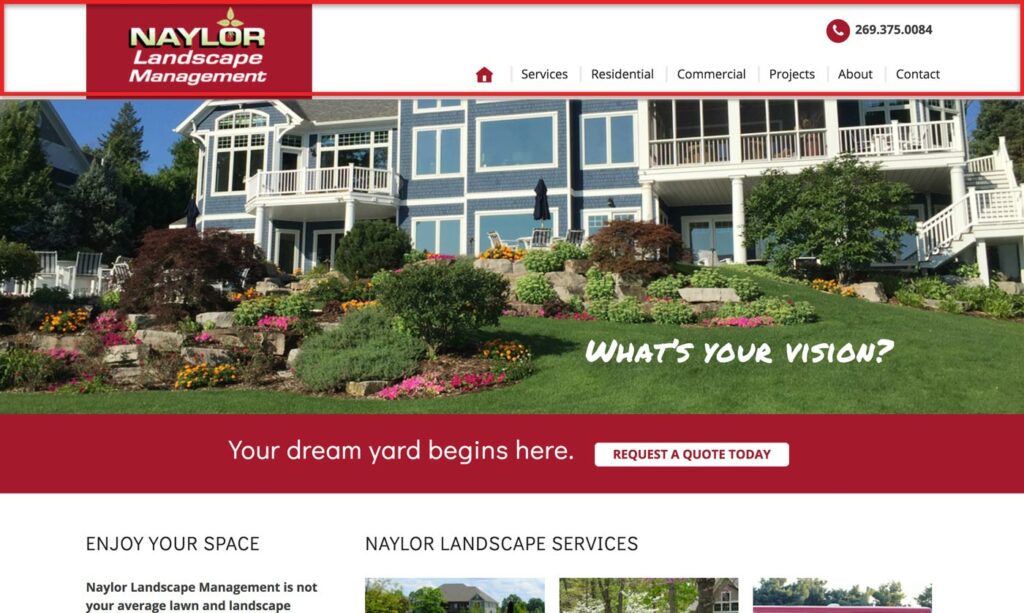
Example of a website header on the Naylor Landscape website, highlighted in red
A header might include:
- Logo
- Navigation menu
- Tagline
- Phone number
- Address
- Search box
- Buttons
- Social media icons
- Login or My Account link
- Opt-in box
It’s good practice to keep the header very simple and lead the user to the navigation menu.
Note that a header is called “sticky” or “fixed” when it stays in place at the top of the window when the user scrolls down.
Navigation Menu
The navigation is part of the header and includes the links that take visitors to other parts of your website.

We often hear clients call these “tabs” at the top of the site, but menus designed to look like tabs are basically non-existent in modern websites. Instead of calling these “tabs,” you’ll instead hear us refer to the menu items as “links” or “pages” in the menu.
Primary/Secondary Navigation
Note that navigation can include both primary and secondary navigation menus. Two separate navigation menus are used when there may be a lot of navigation needed, and you want to be clear which links are most important.

This website includes a primary menu (larger) and a secondary menu (smaller, in a black bar)
The primary menu includes the main, most prominent links. These are generally links to high-value pages on the website like the Services and Contact pages.
The secondary menu includes other links that may not be as transactional or important. This might be links to Login, My Account, or Employment.
Sidebar
A sidebar is an area of the website used to display information that’s not part of the page’s main content.
A sidebar can include an opt-in, call to action, links to other parts of the website, links to popular or recent blog posts, advertisements, social media links, or a brief “About” paragraph for context.
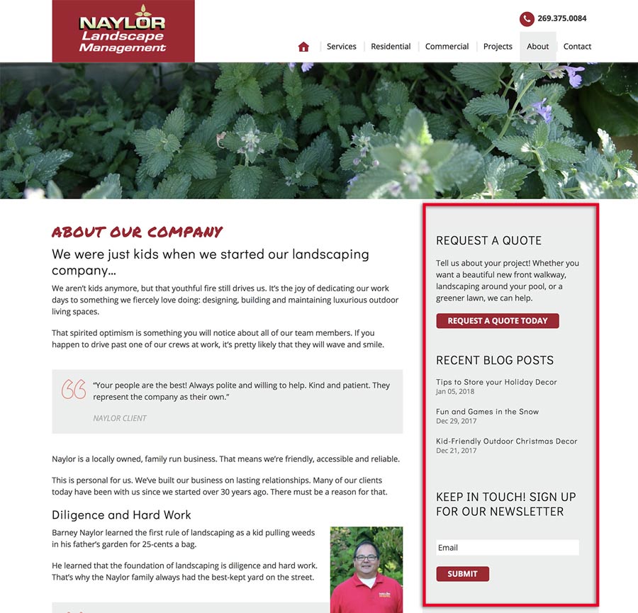
Sidebars used to be very trendy places to throw everything you didn’t want a website visitor to miss. Today, though, there is a lot more talk around the idea that sidebars just add distracting clutter to a website. See this awesome article: Should Your Website Have Sidebars? What the Research Says.
We like when sidebars on the websites are simple and relevant, when they are used. The goal is to simply guide the user to an action we want them to take, not to distract from the main content of a page.
Call to Action
A call to action (“CTA”) is the part of a website that incites visitors to take action. It usually involves an attention-grabbing headline, a sentence or paragraph about the benefits of taking the action, and a button or opt-in box.
It is one of the most important parts of a website because it is what guides the visitor to do what you ultimately want them to do.
Footer
The website footer is the consistent content area at the bottom of every page of your website. Consider it the bottom bun on the website cheeseburger (if the header is the top bun).
The footer can be anything from a single line of copyright information to a multi-section area with contact information, a map, links, opt-ins, social icons, a search box, and much more.
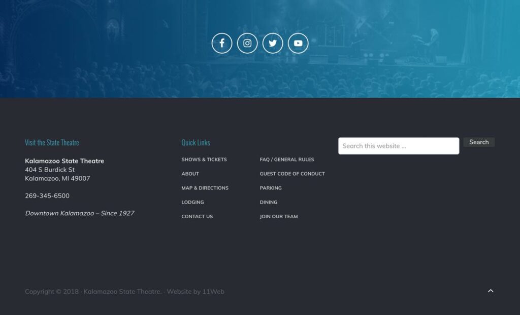
The footer is a great place to catch the visitor’s attention and guide them deeper into your website when they reach the bottom of the page. For some great ideas, check out Orbit Media’s post Website Footer Design Best Practices.
The footer is also where users expect to find Contact information, a My Account link (if applicable), and legal pages like your Privacy Policy.
Armed with this information, you should now be ready to “speak web design!”
The SEO Basics Guide for Wedding Professionals
Get instant access to my top SEO tips, including only what's working right now.

Every creative wedding pro needs a geeky best friend. Let me help you and your work get found online.